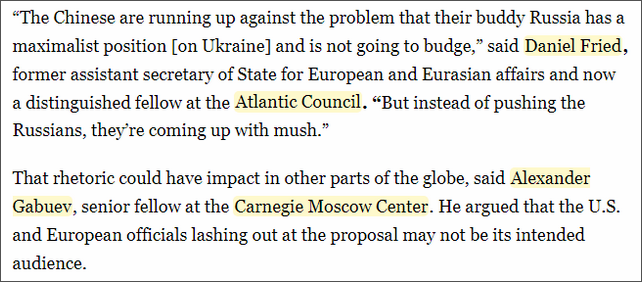
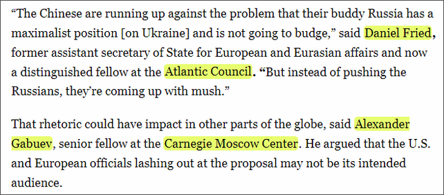
You can choose which highlight and text colors WhoFundsWho uses in the user menu. To help you choose colors that work for you, find some suggested combinations on this page. If you prefer to use only text color and no highlighting then check the ‘no’ checkbox to disable the highlighting.
If you’ve changed the text and/or highlight colors but want to return to the default colors, then click the ‘reset’ button.

Darker text and light highlighting
Soft Sky: highlight #EBF1FF, text #171819
High contrast with a soothing appeal, making it excellent for readability.

Mint Whisper: highlight #C9E7C5, text #000000
Stark contrast between the pale green and black ensures high readability without being harsh.

Cool Mist: highlight #EDEFF6, text #4A4A4A
Almost white background with dark text offers a modern look with excellent legibility.

Lavender Dream: highlight #CCCCFF, text #000000
The subtle contrast with a hint of color provides a visually appealing and readable format.

Morning Sky: highlight #BBE0FA, text #000000
The light and airy quality provides a high contrast against the starkness of black text.

Lemon Chiffon: highlight #FFFACD, text #000000
Pale and delicate, this light yellow presents a bright, airy canvas that enhances the readability of black text, perfect for a subtle hint of color.

Fluorescent Yellow: highlight #E9FF70, text #000000
A vibrant, luminous yellow that offers a striking contrast for black text, enhancing readability with an energetic, attention-grabbing backdrop.

Mint Green: highlight #98FF98, text #000000
The light and airy quality provides a high contrast against the starkness of black text.

Darker Highlighting with Light Text
Dusty Rose: highlight #D96C75, text #515A5A
A muted, earthy red offering a soft yet engaging backdrop.

Deep Teal Dive: highlight #1A535C, text #FFFFFF
Bold contrast with the white text ensures superb readability against the dark background.

Modern Slate: highlight: #757575, text #FFFFFF
Offers a professional, contemporary look with excellent readability due to high contrast.

Vintage Burgundy: highlight #800020, text #FFF0F5
The deep background with light text provides luxurious readability and visual appeal.

Nautical Depths: highlight #273746, text #FDFEFE
Strong contrast reminiscent of the ocean, ensuring clear visibility and interest.

Just text, no highlighting
Vibrant Sky: #00BFFF
Bright and lively, ensuring standout readability against lighter backgrounds without straining the eyes.

Classic Crimson: #DC143C
Offers an effective draw of attention with a strong presence, suitable for emphasizing key texts.

Forest Retreat: #228B22
Calming and distinct, providing a natural contrast that’s easy to read and visually pleasing.

Regal Purple: #7851A9
Adds an element of luxury and sophistication, with good readability against lighter backgrounds.

Earthy Burnt Orange: #FF7034
A warm, inviting color that balances attention-grabbing brightness with subtlety, perfect for highlights without overwhelming.

Note: The descriptions of the colors and color combinations were written by chatGPT.

